
Gigkick Spotify (Case Study)
UI/UX


UI/UX
Type: Dublin Institute of Technology - Digital Skills Academy
Brief: Design & guerilla test a prototype for a new interface feature.
Objective: To simplify the gig discovery process.
Team: Barbara Bugalska (UX, Usability Testing), Marco Novara (Usability Testing, Photography/Video), Martin Knight (Concept, Apple Watch UI, Visual Design), Lewis Murphy (Concept, iPhone UI, Product Video / Animation).
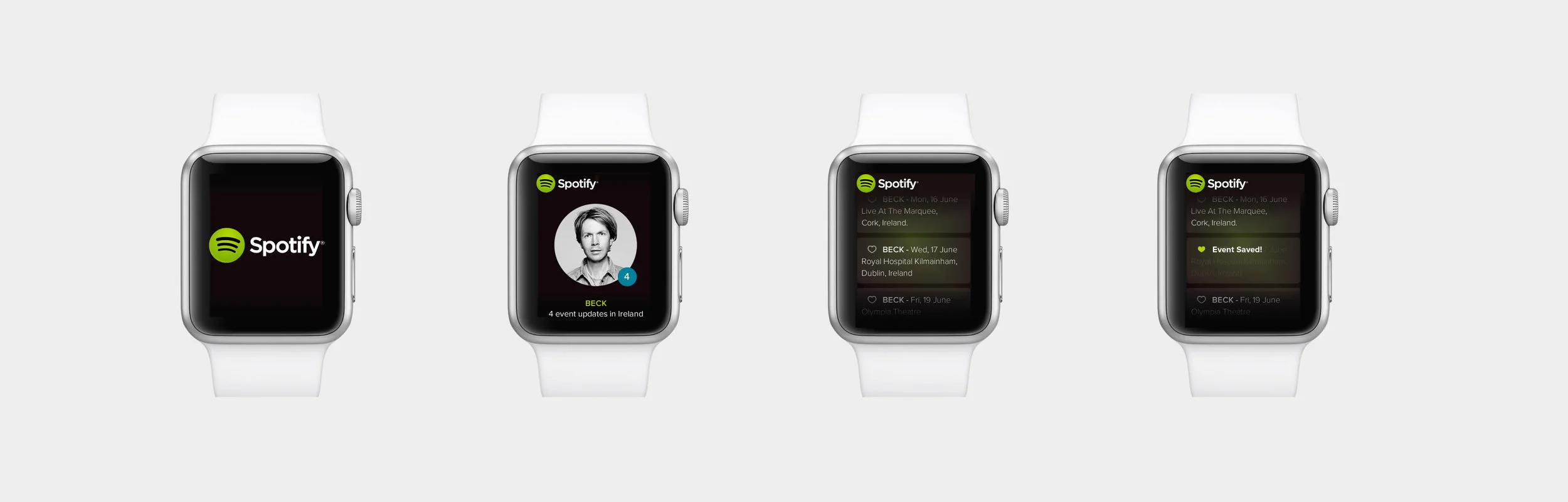
We explored the concept of an event notification feature based on your current location. When close to a venue, or visiting a new city, the "app" could inform you of who was playing near by. Our aim was to take the pain out of searching for tickets to events and simplify the gig discovery process. The idea was later refined to connect with an existing music service where your music preferences would already be stored. We chose the popular service Spotify as it did not already have this feature.
With simplicity and unobtrusive technology in mind, we proposed a concept for the Apple Watch. The limited screen real estate necessitated a stripped back approach, while the haptic responses on the wrist invited a different way of thinking about user interface and notifications. The Apple Watch is ideal for subtle notifications but could only offer a stripped down version of the "full" app, so we looked at the task flow on the paired iPhone to complete the process.
With a view to highlight user interaction and functionality, a series of wireframes and task-flows were created to show a user can complete the specific task of saving an event upon receiving a notification.
Based on the taskflows and wireframes we began focusing on visuals by developing a set of hi-fidelity mockups.
With an initial set of screens designed, we conducted some guerilla testing to assess the usability of the application interface design. In particular to verify the idea of the 'Gigkick’ app and get users design feedback and suggestions to improve the product.
After formally testing our proposed screens and task flow with users, we received positive feedback and suggestions for areas of improvement which we were able to implement in a revised set of screens. Highlighted here are some of the changes we made.
Type of icon used in main app - Initially we used a heart icon to signify how a user saved an event. During the user testing, some participants commented that the heart did not suit the music app. Others noted that that heart icon left them unsure as to whether they were 'liking' or 'saving' an event.
We changed the icon to a star which is more inline with a favourite music event and Spotify’s own usage of “starred” sections to denote saved favourites.
More emphasis on the date in the events listing / reduce redundant information. On our original screens we had the artist’s name repeated in bold for each event listing and the date beside the name in a regular font-weight. In response to comments about date legibility and limited screen real estate we moved the artist’s name to a single instance at the top of the screen and made the date bold in its place to give the essential information greater emphasis.
Colour of the notification icon - Several participants in the user test flagged the colour of the notification icon as something they would change. Although we used the same colour as Spotify’s existing notification icon, we felt it a good idea to change this based on user expectations. The updated icon reflects the colour changes of the new brand colours.
Most of the participants found the ‘Gigkick’ feature for Spotify to be understandable and easy to use. All were interested in getting notifications about their favourite artists and declared they would liked to receive updates about live events in their area. In general participants admired the clean layout, tasteful design, and colour choice. However, simplicity was the most liked characteristic of the product. All of the users found the product to be following the latest trends in technology. Based on the participant's suggestions, a number of changes have been implemented to improve the user experience.